Overview
The app serves as a one-stop online medical assistance center that seamlessly connects patients in need of reliable healthcare with doctors who are willing to offer their expertise—both to support patients and to earn additional income. By bringing both groups onto a single digital platform, the app creates a balanced ecosystem where patients receive timely medical attention, while healthcare providers gain flexible opportunities to extend their practice.Problem Statement
The digitalization of the healthcare sector is rapidly accelerating, with new digital tools, telemedicine platforms, electronic health records, smart diagnostics, and AI-enabled services emerging every day. However, despite this growth, a significant portion of healthcare providers still struggle to adapt. Many find it difficult to understand existing digital systems, face challenges integrating new technologies into their workflow, or lack proper access to digital healthcare infrastructure. This gap has created a divide between advanced digital solutions and the day-to-day realities of medical practitioners, nurses, smaller clinics, and rural health workers.The recent COVID-19 pandemic further exposed this vulnerability. It highlighted an urgent need for dependable, user-friendly, and scalable digital healthcare solutions that can support both providers and patients during critical times. The pandemic demonstrated how essential virtual care, remote monitoring, and simplified digital platforms have become for reducing hospital load, improving access, and ensuring continuity of care.
Design Process
Design Sprint helps to design and deliver the product efficiently and faster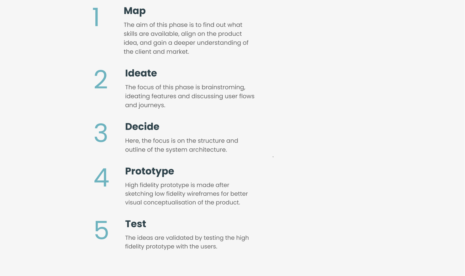
Findings
Qualitative and quantitative researches were done to understand more about the user’s needs and perspectives. A well-structured questionnaire was created using google forms and was given to each participant.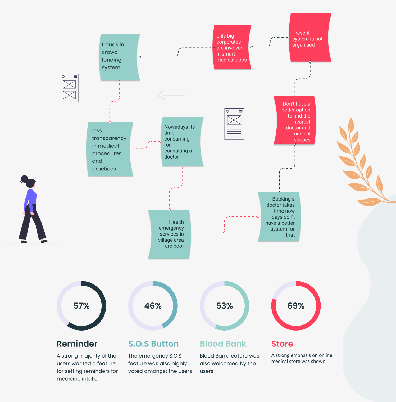
- All the above findings were acquired by interviewing ten potential users.
Competitor Analysis
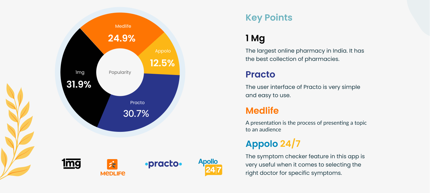
- All the above findings were acquired during the research phase. Source - internet
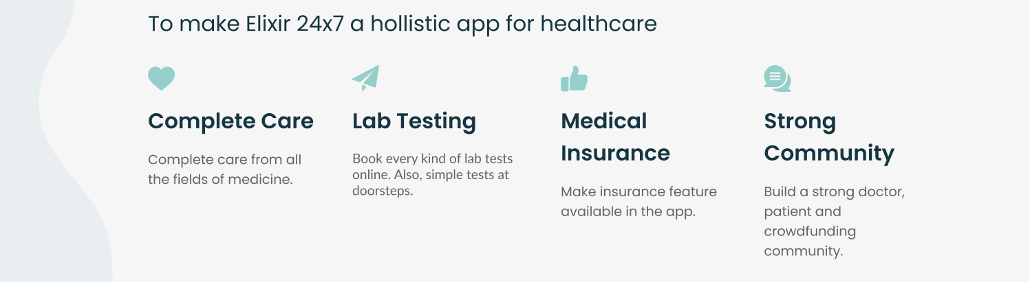
Long Term Goals
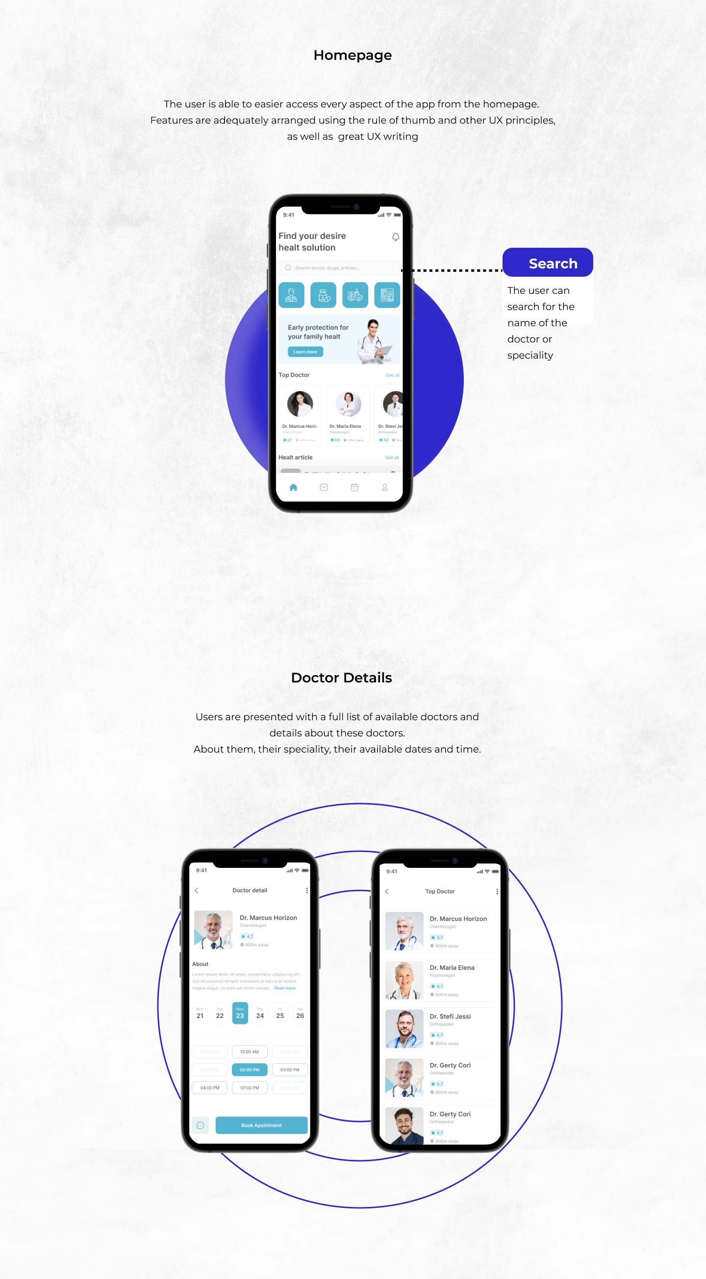
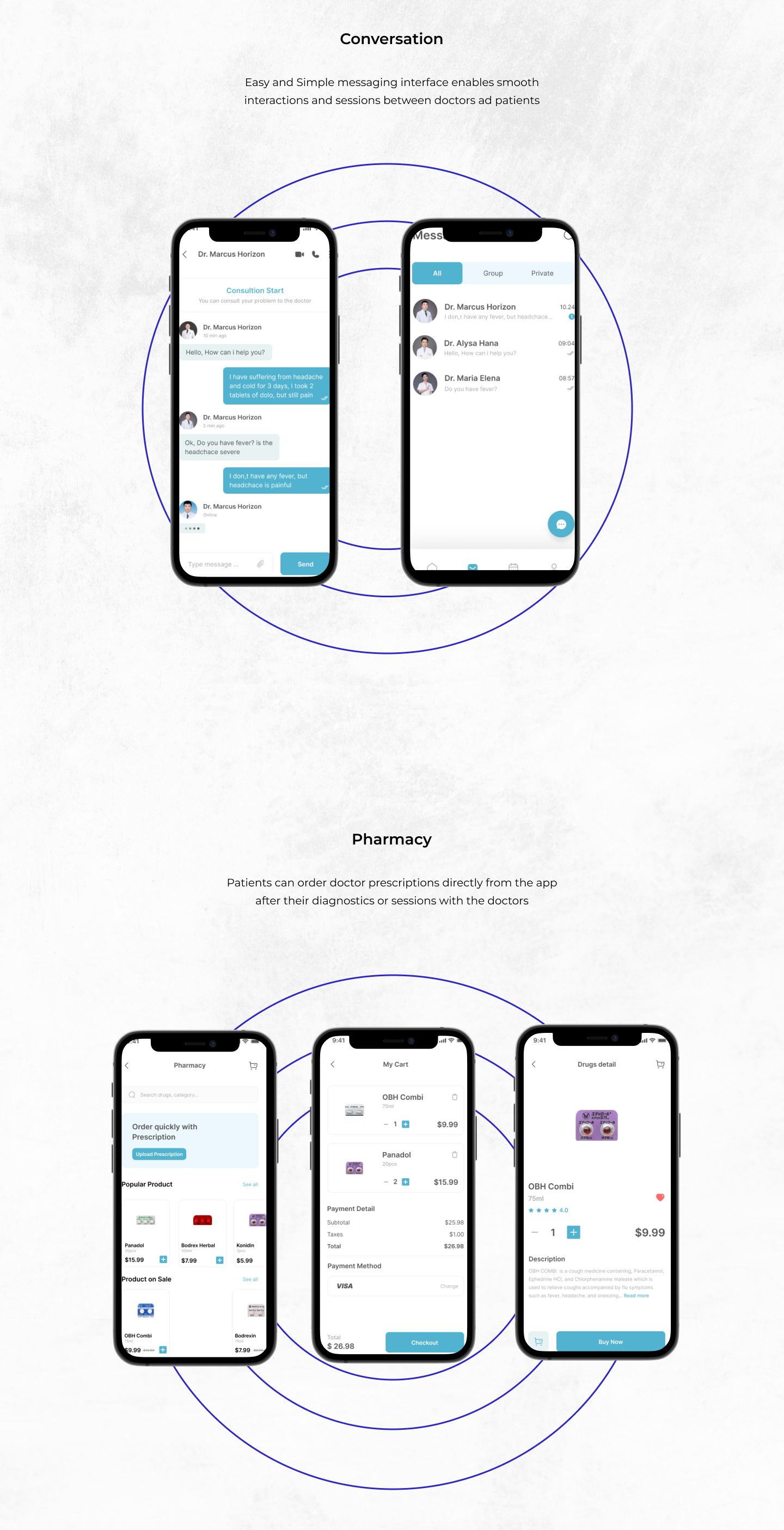
User Flow
The user flow was designed in a way that could incorporate most features in the home screen itself.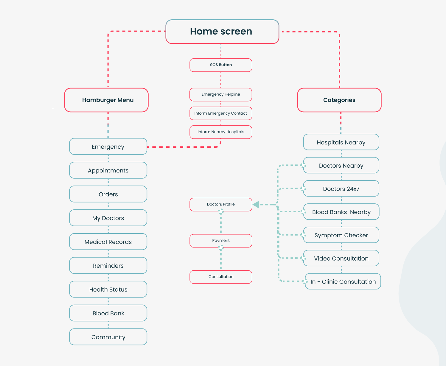
Style Guide
To establish a trustworthy and calming visual identity for the medical app, a carefully curated color palette and structured design framework were created.Color System
Colors were selected using the Adobe Color Library, ensuring accessibility, balance, and emotional resonance.- Turquoise was chosen as the primary hue, using both lighter and darker variants to create a calm, reassuring mood associated with health, wellness, and clarity.
- A soft light red was added as an accent color, reserved specifically for emergency-related features, alerts, and critical UI elements to immediately draw attention without creating unnecessary stress.
Iconography
All icons used across the app were sourced from the Material Design icon library, ensuring:- Consistency.
- Clarity
- Familiarity
- Scalability across devices.
Patient Survey
We wanted to make sure that the user surveys are as simple and straight to the point as possible, we targeted average user as audience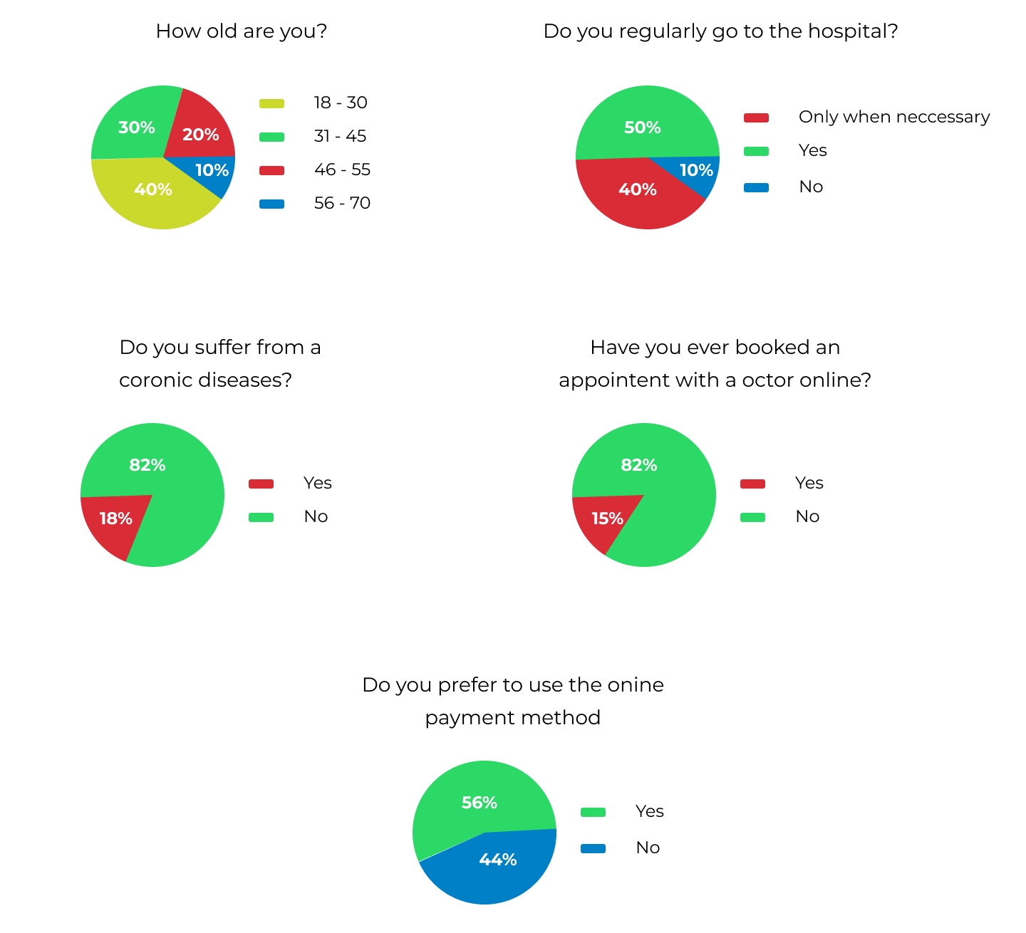
Doctor Survey
We interviewed practicing experienced doctors to ensure accurate information being given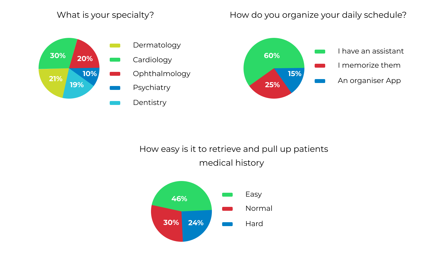
Affinity Map
Using insights gathered from the interviews, we identified several important points that will directly shape the design of the website and ensure users receive the best possible experience. These findings highlight users' expectations, pain points, motivations, and the specific features they value most in a healthcare platform. By translating these insights into design decisions, we ensure the final solution is intuitive, accessible, and aligned with real user needs.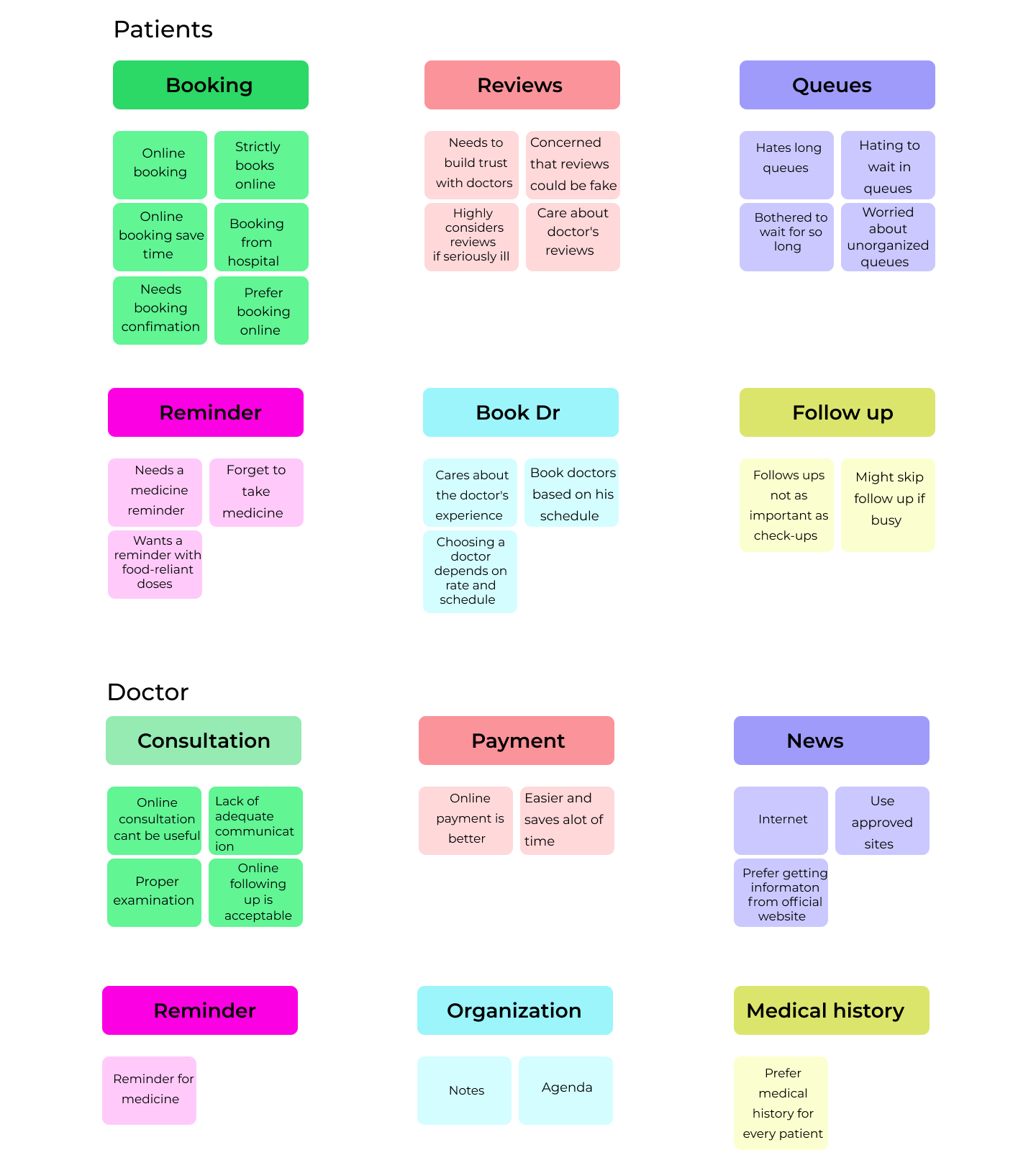
User Personas
To accurately present the point of view of the users, I selected and showcased insights from key individuals I interviewed. These selected participants best represented the different user groups and helped highlight real challenges, expectations, and motivations. By publishing their perspectives in the case study, I ensured the design process remained deeply rooted in genuine user needs and lived experiences.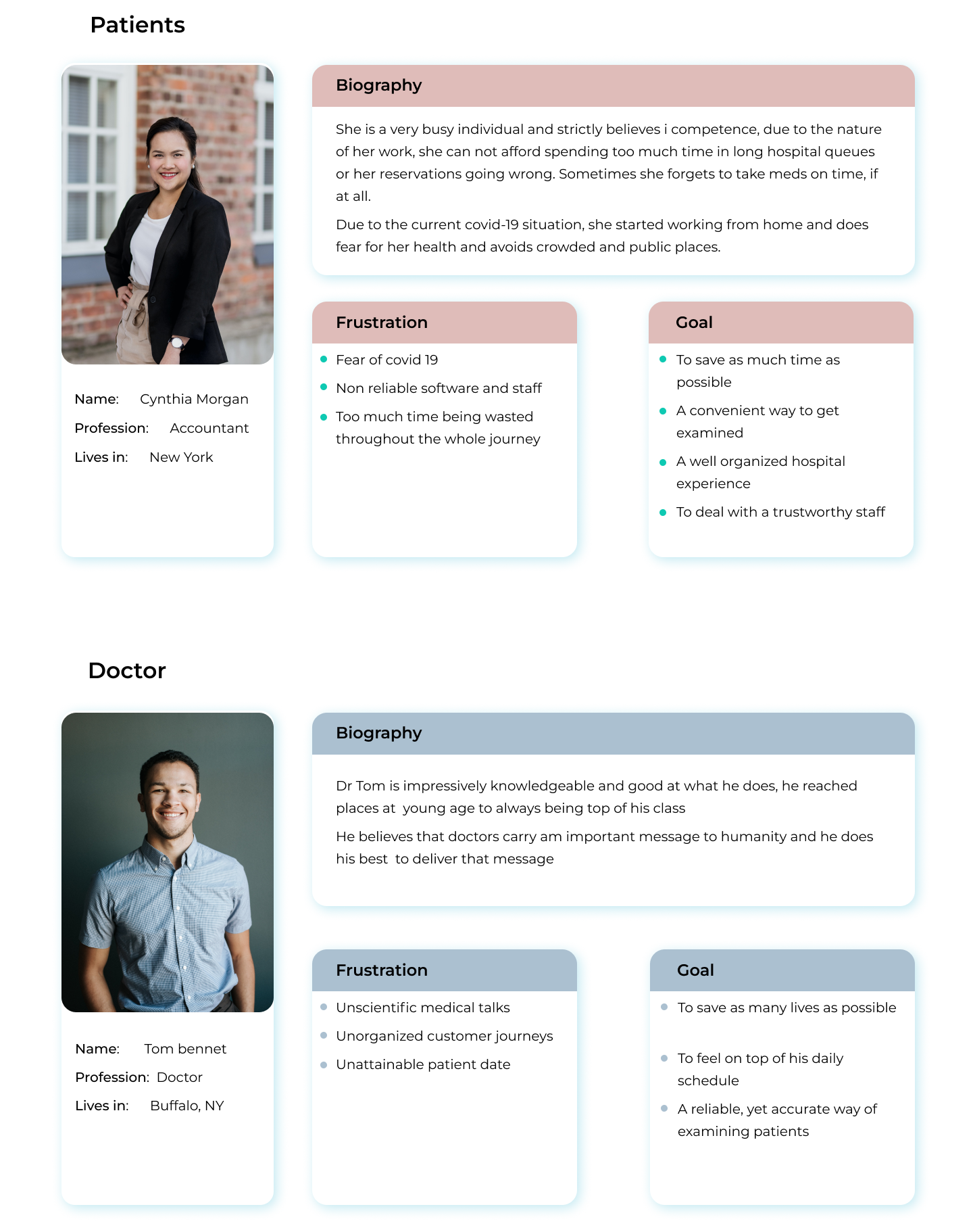
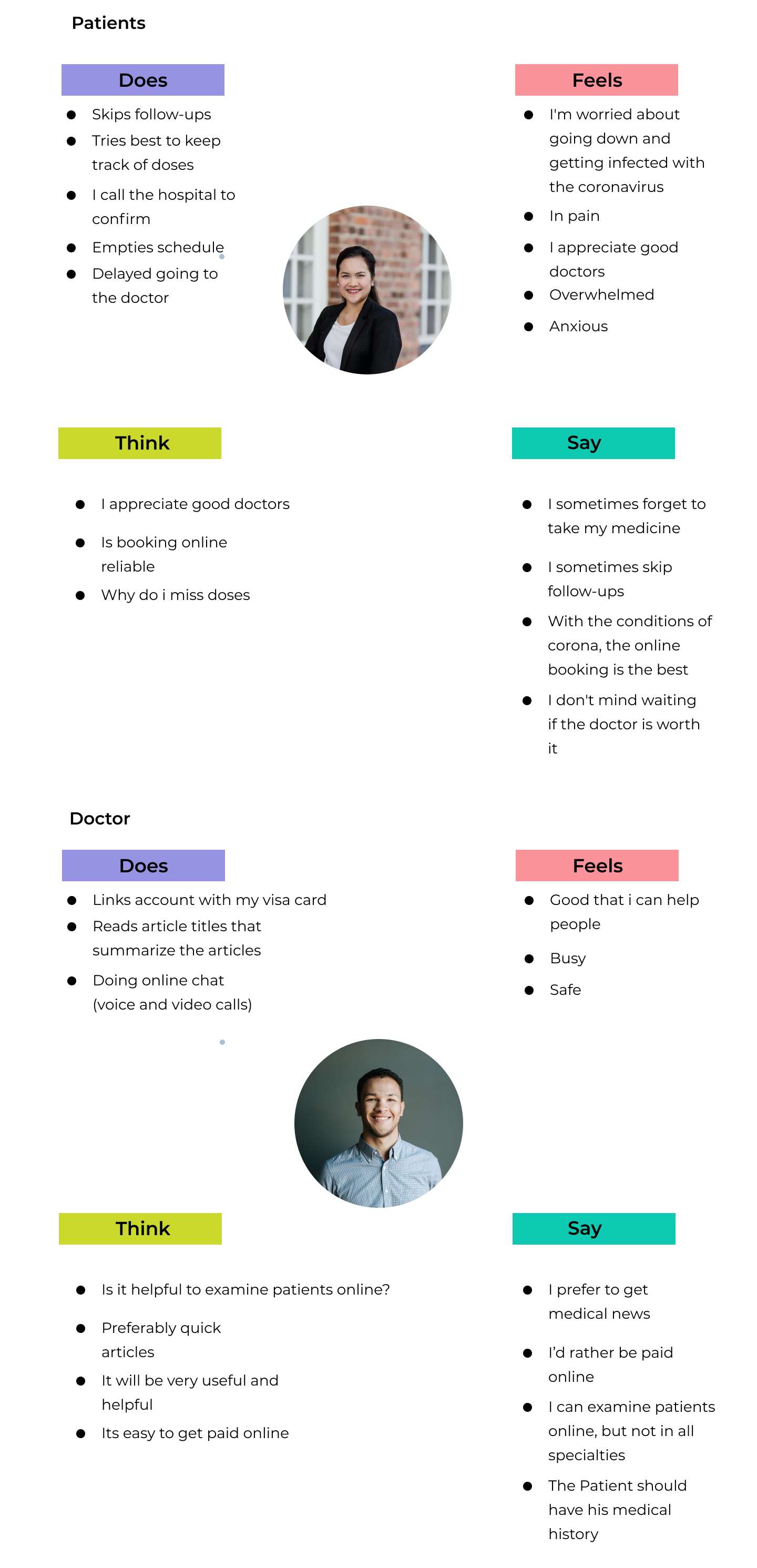
Empathy Mapping
Customer Journey Map
After analyzing the insights gathered from both the survey responses and in-depth user interviews, I moved on to creating the Customer Journey Map. The feedback and real-world experiences shared by the participants played a crucial role in shaping the journey. Their responses helped me clearly identify user emotions, motivations, pain points, and expectations at every stage.
Low Fidelity
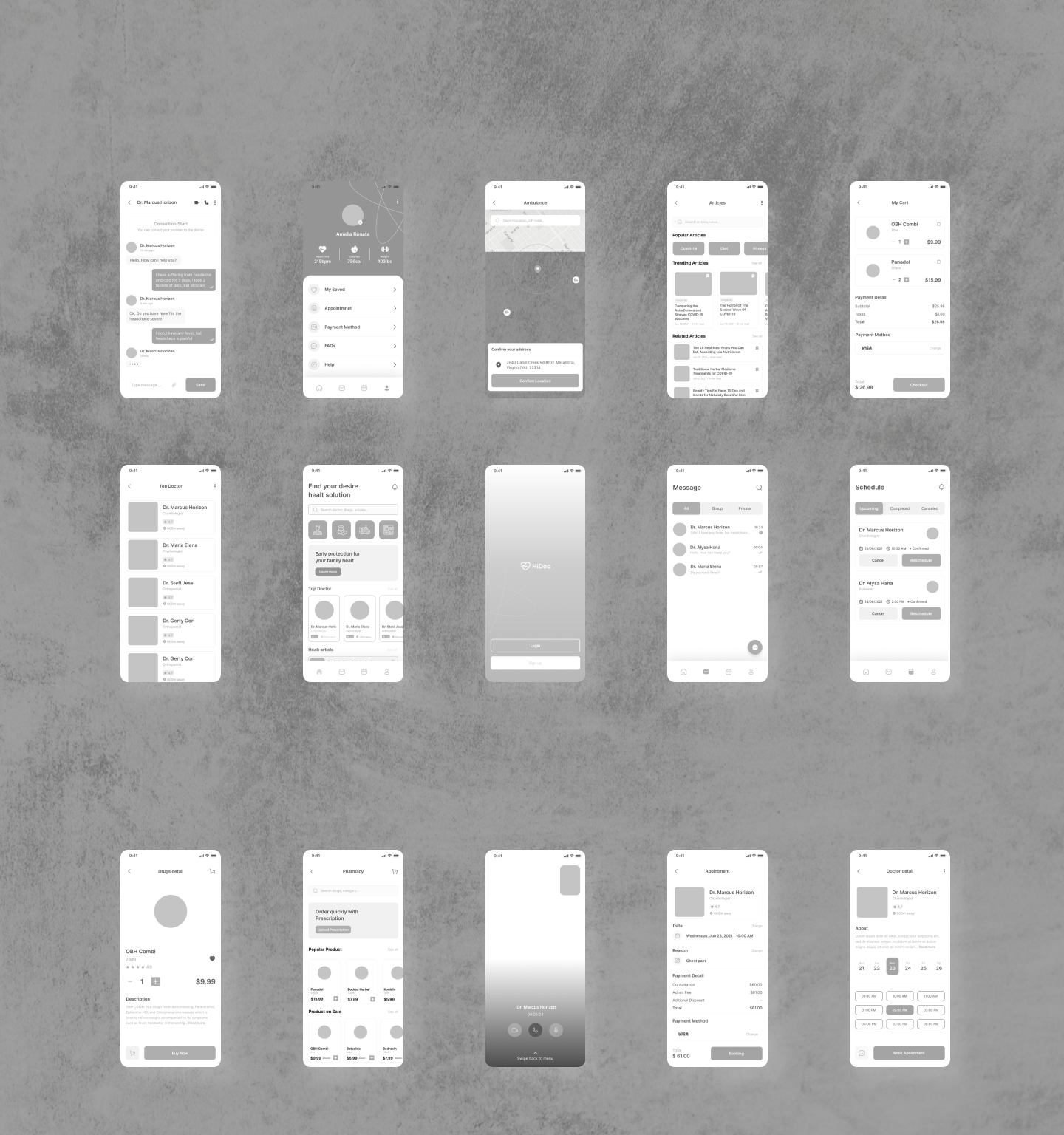
High Fidelity